We wrote a letter to EMI asking their permission to use the song Love the way you lie part 2 for our coursework because of copyright and privacy we may not of been able to use the song of our choice.
In my flat plans which are earlier entries of my blog, I have written ideas about how I'd like and plan for my poster to look. Before taking my images straight away, I have experimented with lighting and depth of field on lights so I'm more prepared for when I take my potential poster images. Below are some of the photos I've taken and how they will help me.
We kept the back cover simple also, using the same font as on the CD front cover. I created the background by using the brush function on Photoshop and the opacity tool to fade in and out. I chose this for my background, as it’s similar to the style I am going to use for my poster, which is out of focus lights. This creates a link between the two. I will also use this background in my CD booklet.
The only problem I had with my back cover was the 'productions' name; on our original cover we made our own record label up to make our product as unique as possible. We took the first letter of our names and came up with MCA. We later discovered there is already a company named MCA records Ltd. And so we changed ours to ACM.
Although we wanted our CD cover and poster to be simple, I realised it was too simplistic and the images used didn't serve any purpose and weren't dramatic enough. After more research and looking back over the Duffy cover that helped us create our first CD cover, I noticed her CD cover worked well due to composition and careful framing of the image, which is where ours lacked. I chose to re-shoot some images, without using the male in frame, mainly because I didn't feel he was needed, although he appears in the video, the song is in fact from the woman’s point of view, so it makes sense to focus on her and capture her emotions in a still, before the music video has even been viewed, giving the audience a feel of what the whole narrative is about.
I took a series of shots (show below) but chose to use this one... I like the composition and think I've managed to capture an essence of sadness within the shot, both by using sombre colours but also as the girl has her face turned from the camera as though she's hiding her face from the viewer. Comparing this cover to the cover I had previously produced, I can see more potential with this version, also I feel it looks a lot more professional, still simple but affective as the image used has more meaning behind it.
I have also chosen to change the name ‘Rhianna’ featured on the front of the CD and poster, as Rhianna is a well-known artist and I wanted to make my work as unique as possible and so have come up with a new ‘band’ name. I have used the name Sweet Confusion for the band name of my music video. I like this name and think it sounds like a believable name of this genre, also the words fit with the narrative of the music video and lyrics, as it is about a couple who love each other but are always fighting, resulting in confusion.
I decided upon this font or my band name as it stood out and wanted to create a logo with the words, so it was obvious this was the name of the band. I’d noticed many other music artists do this also, for example Eminem’s name has been made into a recognisable logo
Below are 2 scanned questionnaires I put together to collect audience feedback about the ancillary tasks I’ve produced. I ask a range of males and females within the target audience range. I have included a males and females below as examples of the sort of feedback I received.
Our original idea for our front and back cover was to use the image of the character's faces as the front cover and the character's back for the back cover. However, when creating the products, we tried our original idea and decided to do the opposite as it would create a better effect and make the audience wonder why this was done. Therefore drawing the audience in and making them pick up the album. Furthurmore, our orginial ideas did not meet the standards we wanted to achieve and we thought swapping the images around worked better as it was more pleasing to the eye.
Below is a reel of clips we decided not to use for our music video. I have explained why below the video.
1-3 seconds.This was going to be a part of the 'flash back' idea we originally had, where the couple were entering the house happy and loved up. we were planning on putting this part in after the fight scene, as though the girl was remembering how they used to be together. We chose not to add this bit in in our final cut as we were worried the audience wouldnt understand it's purpose and a aberrant reading would occur.
4-12 seconds. We decided to change this clip as when the girl walks in, she looks over towards the left, as if shes looking at something. In our first notes and draft ideas we discussed having a photo off the couple on the window sill and then cut to the photo so the audience know what she is looking at. As we chose to take this bit out as we didn't feel it was necessary to the narrative, it meant we had to re-shoot this scene, where the girl walks in and isn't seen to be looking in any particular direction.
13-14 seconds. In this clip, Amy was standing to the left of the frame and the camera captured the edge of her foot in shot. We in fact still used this clip as part of our video, as no one spotted this until after the final cut had been produced but we were able to disguise it by using a transition between the shots.
15-30 seconds. We shot this scene numerous times before we got what we wanted. as you can see from the next clip (31-51 seconds) we changed around where the props were to try and get a more interesting scene. After putting the footage together we realised the take was far too long and we went back and shot it again using more cuts this time to chop the scene up, making it cut faster- like a stereotypical music video. This also made it more pleasing to the eye.
52-1.03 seconds. We all decided the zoom at the end of this clip didn't work and with it being a hand held camera made it look unprofessional as it was wobbly/shaking, which can work in some cases but at this point didn't serve any purpose to the narrative.
As we went along filming we used our storyboard and scrap paper ticking off as we collected our clips, ensuring we had all the scenes we propsed to film. Below is a shot list I put together once we'd filmed all of our clips to organise the order more precisely before editing.
1. What genre does your production fit into, is it clearly does? It may fall between 2 or more (explain why) Our production fits into a typical romance- fairytale type genre. It will be quite clear this is the genre whilst watching the music video as the narrative shows a couple together, splitting and then the ‘happily ever after’ ending. This type of storyline tends to be conventional to R and B videos and just music videos in general seem to follow this kind of story.
2. Of this genre, what conventions have you followed, which have not included and which have changed. Explain why you have made these choices in terms of both creating meaning and their effect of the audience. We’ve included long shots, to set the scene and focus on a specific character, and mid/close ups to show emotions, this should help the audience follow the plot of the music video better and may also mean they engage with the narrative and the feelings of the character. We chose to shoot the majority of the music video in a house as 'Love the way you lie part 1' is set mainly in a house and because we’re shooting a video to the song 'Love the way you lie part 2' we decided to follow this theme as we are keeping a similar narrative to that story almost as it follows on.
3. Audience- to what extent does genre provide a comfort blanket for the audience, or does it use genre to unsettle them. Yes- we have tried to follow on from love the way you lie part 1 original music video and so there will be an expectation that part 2 will follow on in some way and we have made our video so part 2 is the woman’s view of part 1, as this is how we’ve interpreted the lyrics as it’s mainly a woman singing about her feelings in the second one that we’re making a video for.
4. How important do you consider an understanding of genre to be to a preferred reading of your text? Suggest an aberrant or optional reading might occur, if an audience member had no prior knowledge of the genre. The black and white parts of our music video may cause confusion as some readers may not grasp the concept we are trying to create which is a dream scene, but also could be interpreted as a memory, although this also would fit with the narrative so an aberrant meaning could still fit. The lyrics are from the female’s point of view, and so the majority o the camera work is focused on female and her feelings.
Before jumping straight in and beginning to film our music video, we did some experiments using the camera to film simple scenes and then editing them on Power Director. We did a sequence where someone walked through a door and then sat down to text a friend. We thought of a way to film this to make it look more interesting than just one long take. We were able to use a number of different shots in the sequence, such as match on action (hand on door handle) tracking shot (as girl walks in) and over the shoulder shot as she texts her friend, and then cutting between the shots as she texts. We to shoot this sequence as it is simialr to the idea we have for a part of our music video. Doing this has helped us gain more confidence when using the camera and given us an idea of how long it takes to shoot and construct simple sequences.
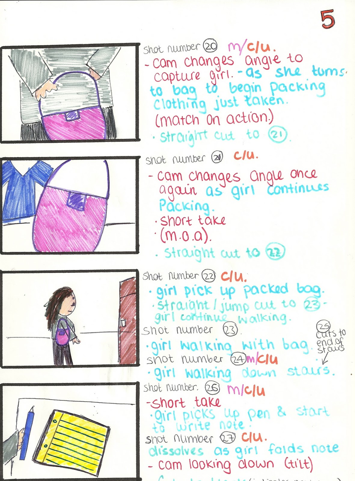
As a group, we discussed the parts of our idea, which we thought would work well, and which may not work as we planned. We took into consideration the equipment and props we have available to us, and also timing, so we were able to fit the frames with the lyrics where we felt necessary. From here, we produced a more detailed and more accurate board of what we hoped to produce in film. We will use this storyboard to work off when filming our music video.


 We designed this poster as a promotional poster to advertise our CD release date etc. We chose to use A4 as the majority of magazines are A4 size.
 < This is a poster for inside of the CD case.